GalleryPal
Design sprint for a gallery application
Role: UX designer
Duration: Five days (Design Sprint)
Tools: Figma

Introduction
GalleryPal is a new startup in the art field. Users are people who have an interest in art and who frequent art galleries and museums. The design sprint was created to improve the experience of viewing art in a museum or gallery. The company provided some background on its services, persona, and the issues it aimed to address.
My Role:
For this project, I conducted a five-day design sprint. This included mapping out the problems, brainstorming possible solutions, and exploring similar applications presently on the market. Additionally, I created sketches for the app prototype and tested it with various users.
The problem:
Visitors seek information about the artwork they're viewing to enhance their experience. While a vast amount of information is available through Google searches on their phones, the sheer volume and length of content can be overwhelming. This often results in users abandoning their search, leading to a diminished experience.
The Solution:
I am focused on improving visitors' experiences in art galleries. There is a need for a user-friendly app that provides easy access to real-time information about the art they're viewing. The app will allow users to scan or photograph a piece of art and, within seconds, deliver relevant information.
DAY 1 - MAP
USERS WOULD LIKE TO HAVE MORE INFORMATION
From an interview with an art gallery guide, it became clear that most visitors are keen on learning more about the artist or the artwork they're observing. Providing a brief background on the artist, coupled with a fun fact, can be beneficial. Understanding the artist's perspective and knowing the context significantly enhances the viewing experience. Additionally, details about the composition, materials, and techniques used can enrich the experience further. However, it's important to note that people prefer concise, key information rather than an overwhelming amount of data.

DAY 2 - SKETCHING
Lightning Demos
A couple of apps that I found can inspire this project:
Dodo Lens Search Image & Video:
The Dodo Lens app allows users to either capture a new photo or select an existing one to obtain information about that image. The returned information comprises a list of websites that provide details related to the image.
The best feature of the app: The 'search tools' feature offers categories that allow users to hone in on their specific search area. Uploading an art piece quickly leads to a page offering an audio explanation of the artwork.


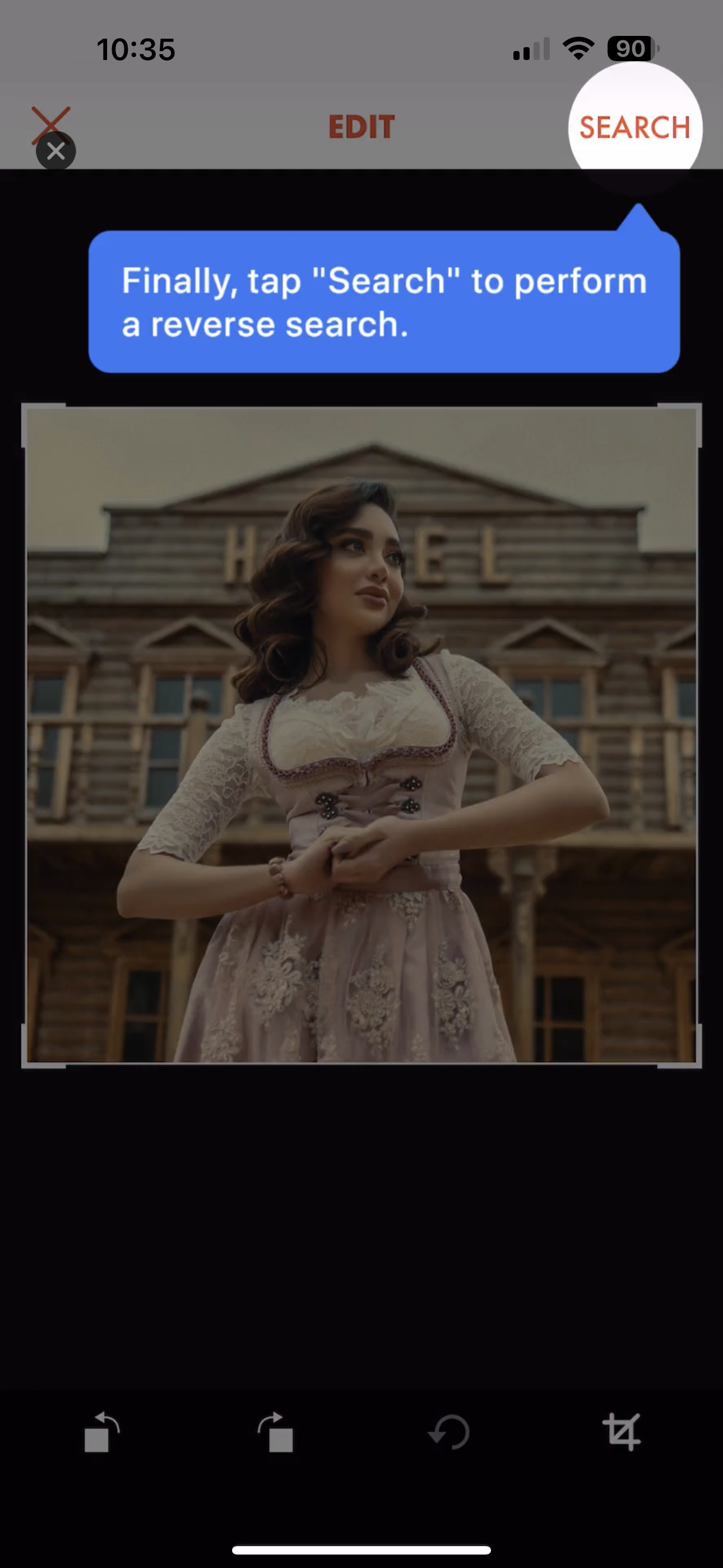
Reverse Image Search:
This app allows users to scan an image on their phone or take a new photo. It then provides results of that picture and others similar to it online. The results are displayed via Google, but there are options to use other search engines.
The best feature of the app: The app provides similar photos to the one scanned.


Picture This:
This app assists users in identifying plants and accessing related information. By utilizing the phone’s camera to capture an image of the plant, the app promptly provides key details about it.
The best feature of the app: The app simplifies the process by allowing users to merely snap a picture of the plant, presenting the information in a neatly organized and logical manner.


Smartify: Arts and Culture:
Out of all the apps I reviewed, this one aligns most closely with what I'm seeking. Designed specifically for art enthusiasts, the app allows users to scan pieces of art and promptly receive information about them. This includes explanations of the artwork, details about the artist, and references to similar works.
The best feature of the app: Scanning is straightforward, and the information provided is concise and easy to grasp. Additionally, the app offers options to delve deeper into details about the artist or to explore more comprehensive information.


CRAZY 8’S
The screen I've identified as most crucial is "Read Info About the Art." I believe this screen delivers the vital information users are seeking. It offers a concise amount of data, and from this interface, users can either exit the app if satisfied or proceed to access more detailed content if desired. This screen appears immediately after a user scans an image.

Solution Sketch:
In my solution sketch, I chose a screen layout that prominently displays the scanned image, accompanied by essential details for users seeking a quick overview of the art piece. Additionally, there's an option to delve deeper into the artwork's background. The inclusion of a play button—for users to listen to the explanation—adds an interactive dimension that I believe enhances the overall experience.

DAY 3 - STORYBOARD
I was confident in progressing with my solution sketch because I believed it effectively addressed the user's needs in the most efficient manner possible.
For the storyboard, I designed seven screens. The initial screen showcases a large image of a featured artist, which rotates weekly. I incorporated an easily accessible bottom navigation bar for user convenience. Upon launching the app, the next step directs users to select the 'scan' option from this navigation bar, enabling them to scan the artwork they're standing in front of, whether in an art gallery or museum.
This action activates the user’s camera within the app. Assisted by a scanning area guide, users can capture the artwork. Following this, they're presented with a loading screen.
Understanding the user:
As I revisited the 'scan' screen, it dawned on me that various user scenarios needed consideration to ensure an optimal user experience. For instance, what if the camera malfunctions, or the ambient lighting is too dim for a clear photograph? To accommodate such situations, I introduced a 'type' feature at the bottom. This allows users to manually enter the name of the artwork or the artist, ensuring they can still access relevant information even when scanning isn't feasible.
The subsequent screen displays the result, prominently featuring a high-quality image of the artwork, accompanied by a header and the artist's name—which is clickable. Recognizing that my users often seek succinct and accessible information, this screen is crafted to highlight key details about the artwork, with an option for those wishing to delve deeper.
Interaction with the user:
I also prioritized user interaction to ensure a seamless experience. To this end, I incorporated a play button, enabling users to listen to a narration detailing the artwork. Instead of sifting through text, users can now audibly receive information, allowing them to fully engage with the art and discern finer details as they listen.
In three steps only:
I'm pleased with this storyboard. It efficiently delivers the necessary information in just three simple steps within the app. Users have the flexibility to delve deeper if they choose to, and the option to listen to the details elevates the overall experience.

DAY 4 - PROTOTYPE
In my prototype, my primary focus was ensuring that users could swiftly capture a photo of an artwork and promptly receive pertinent information, thereby elevating their experience in museums or art galleries. While crafting the prototype, I consciously aimed for a "realistic facade," prioritizing the core functionality over intricate details. This approach allowed me to test my solution without any extraneous distractions.
The prototype goals:
The primary objective of this prototype was to ascertain whether users could swiftly and efficiently obtain information about the artwork before them. My intent was to observe how users engage with the app, particularly the 'scan' feature, and to verify if the app's flow resonated intuitively with them.
What was I hoping to learn:
Through testing the prototype, I aimed to gain insights into several areas:
User Flow: Could users complete the task seamlessly? Were there any hiccups in understanding the app's sequence or layout?
Content Depth: How frequently did users tap on the "read more" button? This would provide insights into their information preferences. Are they content with a brief overview, or do they demonstrate an appetite for more in-depth content? High engagement with "read more" might prompt future design adjustments.
Scan vs. Type: What was the user's reception to the "scan" feature? Moreover, how many opted for the manual "type" option instead?
Audio Engagement: Did users utilize the "play" button? Was this interactive feature deemed valuable, or did it go largely unnoticed?
Gathering these insights will enrich my understanding of the proposed solution, guiding me to ascertain whether we're on the right path or if pivots are required.


DAY 5 - TEST
With my prototype in hand, I sought five participants to undertake testing and provide feedback. Given that the platform is app-based, it was essential to select individuals familiar with app utilization and possessing basic smartphone skills. As the app is tailored for art enthusiasts, it was crucial for the participants to have an appreciation for art. Specifically, I prioritized users who had visited a museum within the past year and demonstrated a keen interest in art exhibitions and museums.
The Interviews
At the onset of the design sprint week, I began recruiting potential testers from among my co-workers and friends. Finding the right candidates proved challenging; many hadn’t met my criterion of visiting a museum in the past year. Nonetheless, after some effort, I successfully identified and scheduled five participants.
I conducted the test sessions in the workspace for three of the users, while the remaining two participated from their homes. Given that all users were familiar with iPhones, I provided my phone for the app test. Throughout the process, I observed closely, taking notes and posing clarifying questions.
I emphasized a relaxed environment, ensuring participants felt at ease. It was vital for them to understand that it was the prototype under scrutiny, not their abilities. This approach fostered candid feedback, proving invaluable in assessing the app's user experience.


The Findings:
After reviewing the notes from the interviews, I sought patterns to discern what resonated—and what didn't—with the prototype. Some feedback was particularly enlightening, prompting me to consider additional refinements that could further enhance the user experience.
From the user tests, I gleaned several key insights:
Functionality: The app operates as envisioned. All five participants effortlessly completed their tasks without any hindrances.
Intuitive Layout: The overall design was comprehensible and logical. There was minor confusion surrounding the '?' button, indicating a possible learning curve for users. However, other interface elements were intuitive and straightforward.
'Favorite' Feature: The unanimous feedback underscored the necessity of a 'Favorite' function. All participants expressed a desire to earmark items of interest for easy future access.
Interactivity Enhances Experience: The interactive 'play' feature was a hit. Participants appreciated the option to audibly receive artwork descriptions, enriching their viewing experience.
Overall Success: The prototype garnered unanimous approval, with all participants indicating they would use the app in a real-world scenario.
CONCLUSIONS
The prototype testing underscores a successful achievement of the intended goal. Feedback was uniformly positive, with all users expressing a willingness to use the app in a real-world context. Evidently, the app adeptly addresses the initial problem by offering a straightforward and swift solution.
Recommendations:
Based on user feedback, I recommend the following:
Retain 'Scan' and 'Type': Both the 'Scan' and 'Type' options should be kept. However, consider rephrasing 'Type' to a more intuitive term for user clarity.
Include Location: Ensure that the key information provided also includes the location of the artwork for added context.
Optimize the 'Favorite' Button: While retaining the 'Favorite' button, assess its placement. It may be beneficial to keep it visible as users scroll through the information, rather than having it fixed at the top.
Recommend Similar Artwork: Explore the possibility of suggesting similar artworks within the same museum based on the user's location, enhancing their overall museum experience.
What I’ve learned:
In this design sprint project, I was uncertain about the scope of learning within a mere five days. However, I've come to appreciate the design sprint process as incredibly agile and insightful. These intensive five days are invaluable, regardless of whether the outcome is a promising prototype or a constructive failure.
Furthermore, I've realized that perfection isn't a prerequisite for constructive feedback. In a relatively brief span, it's entirely feasible to grasp a complex issue deeply and devise a strategic approach to address it.


