SubHub
User research for a subscription management application
Role: UX designer
Duration: 6 weeks
Tools: Figma, Illustrator

Introduction
SubHub is an easy-to-use centralized platform app for identifying and tracking subscription and membership expenses, potentially saving users hundreds or thousands of dollars annually. In today's digital age, the ease of ordering services (just a click away) makes losing track of expenses easy to do. To address this problem, I developed SubHub, which provides insightful reports (weekly, monthly, or yearly) organized based on user preferences for better spending control.
The Problem
WITH TOO MANY SUBSCRIPTIONS, IT’S HARD TO KEEP TRACK ON IT
Every day, we’re inundated with countless services, and with just one click, we can easily purchase or subscribe to them. However, this convenience also leads to us losing track of all our subscriptions. Many people keep paying for services they no longer need or use.
GOALS
Help users keep track of their subscriptions
Make the task of unsubscribing from a service easy and accessible
Help users to be aware of their spending
USERS
Ages 30+ who use smartphones and subscribe to different services
The Solution
ONE APP TO TRACK IT ALL
My research revealed that many individuals continue to pay for subscriptions they no longer use. An app that lists all subscriptions, provides renewal reminders, and guides on how to unsubscribe can save users substantial money annually. SubHub empowers users by centralizing their subscriptions, facilitating unsubscriptions, and enabling reminder settings. The app displays subscriptions in a list, on a calendar view, and provides spending reports to aid in making financial decisions. Having it all in one place makes subscription management an easy task.
RESEARCH
“42% OF PEOPLE HAD STOPPED USING A SUBSCRIPTION BUT FORGOT THEY WERE STILL PAYING”
SECONDARY RESEARCH
In my secondary research, I aimed to understand why people opt for subscriptions and how they can better manage them. I researched numerous articles and studies on this subject, which deepened my understanding of the issue and the problem I intended to address.
The findings:
Subscriptions help people access services through a one-time action, saving them time in the long run.
Many individuals continue to pay for subscriptions they no longer use or need.
When asked, only half of the respondents knew how to cancel a subscription.
Most people believe that it’s easy to overlook their recurring monthly subscription charges.
HEURISTIC ANALYSIS
Given that I was developing an app in a space with existing solutions, I explored similar apps to understand their offerings and problem-solving approaches. I analyzed three market-leading apps: RocketMoney, Mint, and PocketGuard. After analyzing the three apps, I identified several key takeaways:
All subscriptions should be presented in a well-organized and user-friendly preview.
The interface should offer clear shortcuts and buttons to manage subscriptions, particularly for easy unsubscribing.
Users value reminders before their subscriptions auto-renew.
Reviewing these apps provided valuable insights and informed my strategy for addressing the issue.

IDEATION
SOLUTION: ONE APP TO MANAGE ALL SUBSCRIPTIONS
After understanding users' pain points and needs, the solution seems to be a single application that centralizes all subscriptions and is easy to manage. The app will provide clear guidance on how to unsubscribe and offer insights into subscription expenditures, as well as categorize subscriptions for easier management.
PRIVACY VS CONVENIENCE
One challenge I needed to tackle was assisting users in adding all their subscriptions to the app. In my heuristic analysis, I found a solution used by the RocketMoney app that I liked. This solution involves having the user connect their bank account to the app. Once the app has access to the bank account, it would analyze the data to retrieve subscription information for the user and display it within the app. However, not all users are comfortable sharing personal information, especially their bank account transaction data. Therefore, I decided to offer users the choice of connecting their bank account, in addition to the option to manually add their subscriptions, providing users the freedom to select the option that suits them best.

SITE MAP

USER FLOW
In my user flow, I emphasized two critical pathways for users: viewing a comprehensive list of all their subscriptions and receiving guidance on how to unsubscribe from a service. Ensuring simplicity in executing these tasks is paramount to the app's success.


Sketching was a low-cost way for me to discover the constraints of the app. Once I had a clear vision of my solution, I began sketching the app's design. I envisioned the app starting with a presentation of all subscriptions in a list format on one page, complemented by a prominent button on the main screen to easily add new subscriptions. I incorporated a calendar tab to allow users a calendar view of their subscriptions and a reports tab to give users a clearer picture of their subscription expenditures.
SKETCHES


Based on the sketches, I created wireframes to start testing the app with real users. Given the substantial amount of data users need to view, I focused on designing clean and intuitive screens. My primary focus, or the 'red routes', included adding a new subscription, locating a specific subscription on the list, and unsubscribing from a particular service. For the app's success and efficiency, users should easily perform these three tasks.
WIREFRAMES

TESTING
FIRST ROUND OF TESTING - LOW-FIDELITY DESIGNS
In the initial testing round, I aimed to observe user interactions with the app and assess the ease of task completion. Using my low-fi screens, I tested the app with five potential users from my target demographic. I gave each participant six tasks and observed their completion process and any obstacles they encountered. Overall, users found the app intuitive and the navigation straightforward.
UNRECOGNIZABLE ICONS
In the wireframes, I opted for icons to represent each subscription category, aiming for a cleaner aesthetic with less text on data-dense screens. However, when testing the wireframes, I discovered that most users struggled to recognize the meaning of each icon. As a result, I realized a more effective solution would involve displaying the category name and assigning a distinct color to each.
Use of categories names in the hi-fi screens
Use of icons in the wireframes
MORE INFO ON THE EXPENSES DIVISION
Feedback from three users highlighted a desire to view their spending by categories directly on the main screen, preferably in chart form. While I wanted to address this, there's already a dedicated reports tab providing such details. To address this, I added a line of text below the monthly total, indicating the user's highest expense category for that month. Accompanied by a “see more” button, it directs users to the detailed reports page. This provides users with a concise overview on the main screen, while offering easy access to more detailed insights.

VISUAL STYLE
COLOR

In light of the extensive data displayed in the app, I prioritized a clean and minimalist design. I opted for a classic black and white palette, supplemented by a few soft accent colors representing different subscription categories. This approach maintains the app's simplicity while enhancing its aesthetics.
LOGO
I envisioned the logo to embody simplicity with a touch of sophistication. I chose the name 'SubHub' for its catchy, user-friendly connotation, symbolizing a centralized hub where users can save, view, and manage all their subscriptions. The icon incorporates two arrows, designed in a circular pattern, echoing the recurring nature inherent to subscriptions.
COMPONENTS


TESTING #2
TESTING THE HIGH-FIDELITY DESIGNS
After the feedback from the initial testing phase, I moved on to designing the high-fidelity screens, with a keen focus on user needs. My aim was to create an app that is user-friendly, informative, streamlined, and inviting. With the design in place, I conducted tests with five participants fitting my target audience criteria. They were tasked with completing six actions, mirroring the first testing round. A standout observation was the unanimous appreciation and utilization of the “sort by” button, which all participants found beneficial.


THE SLIDE MENU ISSUE
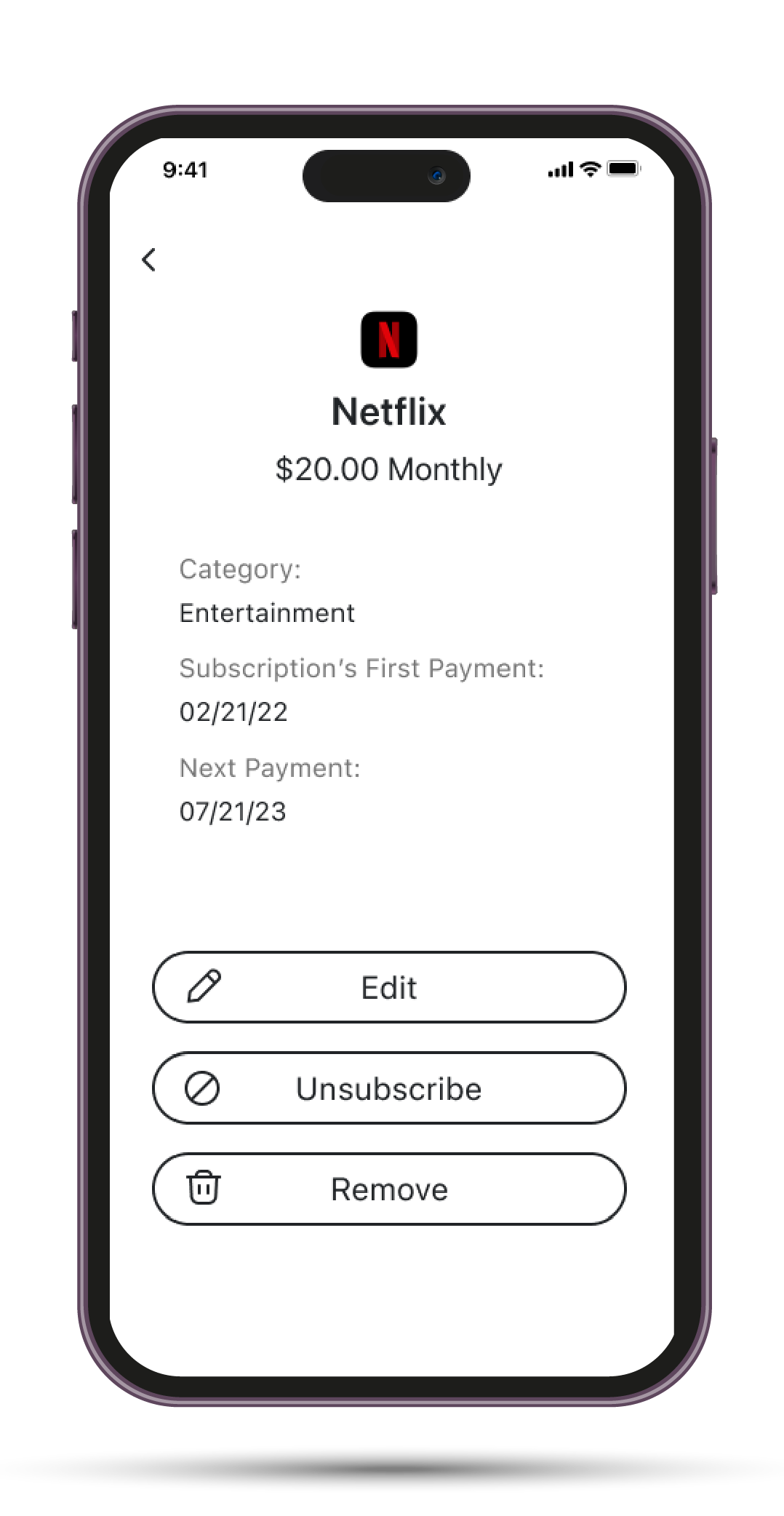
As I conceptualized the design of the main screen, a primary goal was to present a clear list of all subscriptions, complemented by easy shortcuts for editing, unsubscribing, or removing a subscription. My solution was a slide menu for each subscription — revealed by dragging left — offering three actions: edit, unsubscribe, and remove. However, despite orienting users about this feature, four out of five participants didn't utilize the slide menu. Instead, they navigated to the subscription's info page to execute their desired action. This led me to consider integrating a gesture or animation in the final app version as a cue for this sliding feature.
Another challenge with the slide menu was spatial constraints. While I aimed to restrict the slide menu to half the width of the subscription entry, the word "unsubscribe" proved too lengthy for the limited space. Given its infrequent use — which I felt didn't warrant a dedicated shortcut — I opted to eliminate the "unsubscribe" option from the slide menu, retaining only "edit" and "remove."
Version # 1
Version # 2


IGNORING THE CALENDAR TAB
An intriguing observation from the second round of testing was users' reluctance to fully utilize the calendar tab and its features. For one task, I instructed participants to identify and remove a subscription dated July 21st. Anticipating they would directly access the calendar tab to swiftly locate and manage the subscription, I was surprised when four out of five users bypassed it entirely. Instead, they scrolled through the main screen's list to find a subscription set for that specific date. While all participants successfully completed the task, the calendar function could have expedited this process considerably, especially if the subscription list becomes extensive. This reaffirmed my belief in the utility of the calendar tab. In the final app version, I plan to integrate a brief introductory video, emphasizing the advantages of the calendar tab to optimize user experience.
CONCLUSIONS
THE USER IS IN CONTROL
In this project, my goal was to develop a solution for users overwhelmed by multiple subscriptions and struggling to manage them. The secondary research was instrumental in providing foundational knowledge about subscription behaviors and the underlying psychology of why users opt for such services. Additionally, the heuristic analysis was invaluable for gleaning insights on the strategies implemented by other apps.
Central to my vision was instilling a sense of control in users over their subscription expenses. Given the plethora of available services, tracking all active subscriptions can easily become daunting. The cornerstone of SubHub's success, I believe, lies in empowering users, making them feel they've regained control over their subscription expenditures. To achieve this, the app needs to incorporate several key features:
SEE IT ALL IN ONE PLACE- One of SubHub's standout features is its ability to centralize all of a user's subscriptions in one accessible location. Once a subscription is added, management becomes effortless with intuitive controls and timely reminders before auto-renewals.
HELP THE USER WITH CLEAR INSTRUCTIONS- In a study conducted by C+R Research on subscriptions, only half of the participants were aware of the exact procedures and timings to cancel a subscription. A distinguishing feature of the SubHub app addresses this concern: it provides users with clear, step-by-step instructions for each subscription, including direct links to facilitate the unsubscription process.
ORGANIZE THE DATA FOR THE USER-A notable feature of the app is the report tab. By collating all the data, categorizing it, and presenting it in an intuitive chart format, we empower users to clearly see their spending patterns. This insight can guide them in identifying areas where they might want to reconsider and potentially reduce expenses.
IF ONLY I HAD MORE TIME
Reflecting on the two rounds of testing, the feedback was overwhelmingly positive. The app achieved what I envisioned: a balance of simplicity with sophistication. Many test participants attested to its potential usefulness. Given more time, I'd revisit the design and functionality of the Calendar and Reports tabs. Both hold significant promise in enhancing user experience, warranting further aesthetic and functional refinements. In its current state, the app stands as a robust solution, poised to assist many who seek a more efficient way to manage their myriad subscriptions.
REFLECTION
DO NOT REINVENT THE WHEEL
When I first delved into this project's topic, my initial inclination was to conduct multiple questionnaires and interviews to understand people's subscription habits. However, I soon recognized that while firsthand data collection has its merits, it can also be time-intensive. Sometimes, alternative approaches offer more efficient and equally informative insights. By focusing on in-depth secondary research, I discovered a wealth of existing data that mirrored the insights I hoped to gather through interviews. This not only saved time but also supplied me with high-quality data pivotal for shaping the project's direction. Another significant takeaway was the realization that while numerous apps and solutions already exist, innovation doesn't always mean starting from scratch. It can be about analyzing existing solutions, learning from their strengths and limitations, and iterating in a distinctive, improved direction.
USERS FEEDBACK EQUALS GOLD
Undoubtedly, the insights from the two testing rounds were immensely beneficial. Observing users directly, hearing their feedback, and watching their interactions with the app proved to be paramount. Given more time, I'd conduct additional testing sessions to refine features further and gauge deeper user interactions. The knowledge gleaned from direct engagement with users is truly invaluable.


