
PalCal
User research for a parents' shared calendar application
Role: UX designer
Duration: 6 weeks
Tools: Figma, Illustrator

PalCal is a shared calendar mobile app that helps parents plan together for upcoming appointments, tasks, and events more efficiently. The user-friendly app addresses the needs of millions of parents in the US to stay on top of their busy schedules by knowing what is planned or required each day in advance. The ‘Reminder” feature ensures appointments are never missed.
In addition to being a shared calendar, the app functions as a multitasking tool, providing users with a one-stop shop link to multiple sources such as restaurants, sporting events, services, etc., eliminating the need for individual apps.
Maintaining a simple user experience was integral to the success of the product’s design.
I was responsible for all research, evaluation, and the entire design process.
Introduction
The Problem
TOO MANY APPS, TOO LITTLE TIME
As a young parent, I struggle with planning activities efficiently, and the scarcity of free time often results in neglecting relationships and fewer date nights. Amidst the multitude of existing apps, even a simple task like reserving a restaurant can feel overwhelming and time-consuming.
GOALS
Encourage parents to plan more activities together
Make planning an easier task for young parents
Reduce the number of apps needed to plan an activity
USERS
Parents with young children who use mobile apps for their daily activities.
The Solution
MAKE IT SIMPLE, FUN, AND A ONE-STOP SHOP
Through my research, I discovered that parents lack extra time and crave easy, quick solutions. Addressing the frustration of using multiple calendar apps, I developed PalCal, a shared calendar app that syncs seamlessly between two parents. It consolidates all planning in one accessible place and facilitates reservations (dining, shows, experiences, and spa) directly through the app, simplifying the process for busy parents.
RESEARCH
PARENTS DON’T HAVE ENOUGH TIME BUT WOULD LIKE TO PLAN MORE
SECONDARY RESEARCH
In my secondary research, I tried to understand why parents of young children often neglect their relationships. Data from numerous research studies and articles provided valuable insight into the app’s design.
The findings:
There is a stressful lack of communication and coordination between parents regarding scheduling, planning, and knowing about upcoming appointments or events.
Parents must use multiple apps because there is no efficient single-source platform for all planning that provides a clear, centralized overview for both parents to view, thus resulting in confusion and tension.
Lack of free time is a major factor in the neglect of new parents' relationships.
Lack of adequate sleep hours is a negative factor affecting parents in kindling their relationship.
Parents desire more date-night activities.
SCREENER SURVEY
For the screener survey, I selected people who met my specific criteria, including:
Parents whose youngest child is under the age of six
Parents who reported that the amount of their date night activities, in the past three months, was 8 times or less.
Parents who use calendar apps to plan their activities
After sending out the survey, I quickly identified people fitting my target audience, allowing me to continue to the interview stage. A follow-up email was sent, resulting in five scheduled remote video interviews. The input I received was invaluable in designing the app.
INTERVIEWS
I had five interviews with people who fit the description of my target audience, that reported that their number of date nights has decreased drastically since they had kids. The interviews were done remotely in recorded sessions.
A few insights from the interviews:
A shared calendar is crucial for parents' planning
The fewer apps that need to be used the better
The experience with the app has to be simple and efficient
“My work calendar and personal calendar are separate, I wish I could synchronize them, that would be so helpful” (interviewee #5)
AFFINITY MAP
FEATURES, MOTIVATION, OBSTACLES, AND AVAILABLE SERVICES
Once I had all the data from the interviews, I wanted to find the categories I could divide all the data into. My goal was to find the obstacles that cause parents to plan fewer date night activities, and understand the reasons for that. I came up with four different categories:
Features- What type of things were mentioned that the interviewers liked about the current services they use for time planning, such as setting reminders, the ability to share a planned activity, and being able to sync different calendar apps.
Motivation- what kind of things can motivate people to make more plans and take more actions such as planning ahead of time and making things simple.
Obstacles- what things were mentioned as things that are making it harder to make plans for date nights such as lack of time, spending a lot of money, and lack of a sufficient planning service/app.
Available services- what apps or services are currently being used to plan activities? Most users use calendar apps (the Google Calendar app was very popular among the interviewees).


EMPATHY MAP
Making the empathy map helped me think more like my user, and by dividing the insights into categories, I understood better what my user’s goals, pain points, motivations, and feelings are. Based on that I could create my user persona.
PERSONA
RACHAEL- A 33-YEAR-OLD TEACHER, MOM OF 2 KIDS
The persona I created is a 33-year-old teacher, mom to two children, married to Tom, and has a busy daily schedule. She’s interested in spending more quality time with her husband and wishes to use one app to plan all of her activities.

JOBS TO BE DONE
I created job statements and need statements based on my findings:
Job statements:
Main Job: Increase young parents' quality time by planning ahead better
Relate Job: Improve scheduling activities by planning together
Relate Job: Encourage scheduling of mutual activities by offering easy solutions
Need statements:
Feel motivated by easy-to-use service
Maximize the ease of planning an activity
Increase the motivation of young parents to plan date activities
Maximize the options of date activities for young parents
HMW QUESTIONS
THE PROBLEM: PARENTS DON’T PLAN ENOUGH DATE-NIGHT ACTIVITIES TOGETHER
How might we encourage young parents to schedule more date night activities?
How can we make planning date nights an easier task for young parents?
How might we reduce the number of apps/tools young parents use to plan their activities?
IDEATION
SOLUTION: CREATE A SHAREABLE CALENDAR THAT SYNCS TO OTHER APPS
Recognizing my persona's needs, I found a solution in creating a shared calendar app synced with other apps, streamlining planning in one user-friendly platform. To boost motivation, I integrated gamification into the app's interface.
USER STORIES

SITE MAP

USER FLOW
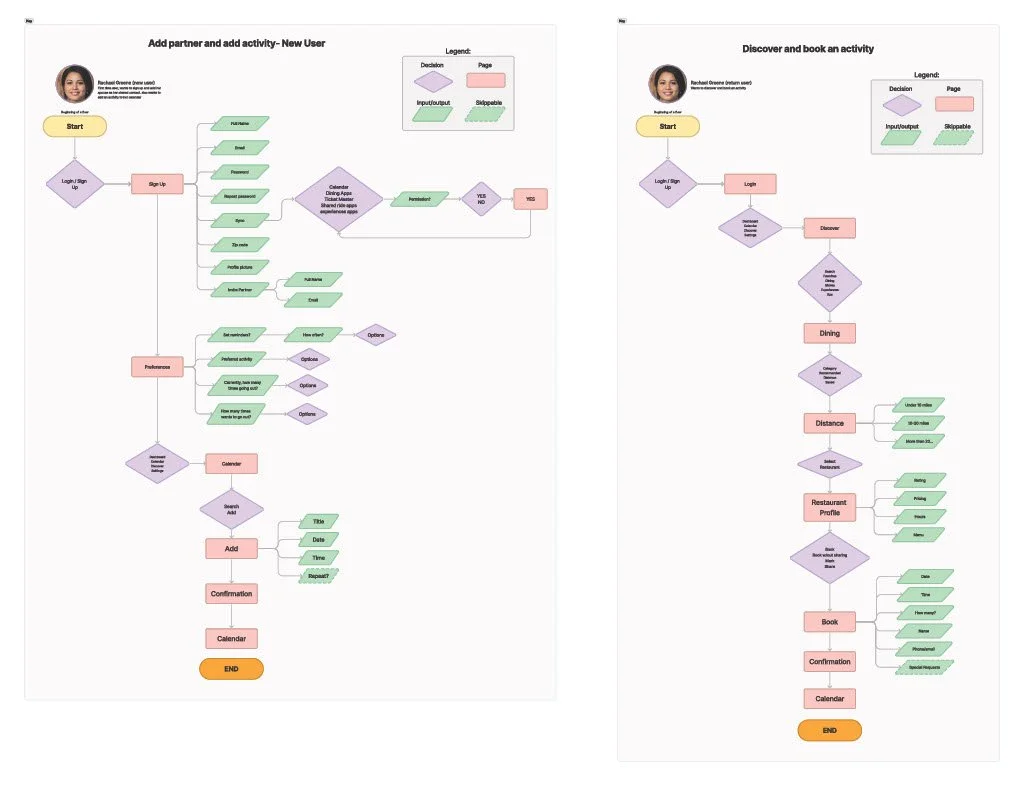
In my user flow I focused on two important routes for my persona; add a partner to share the app with, add a new activity on the app, and discover and book an activity. Being able to do these tasks, in a simple way, is crucial to the success of the app.
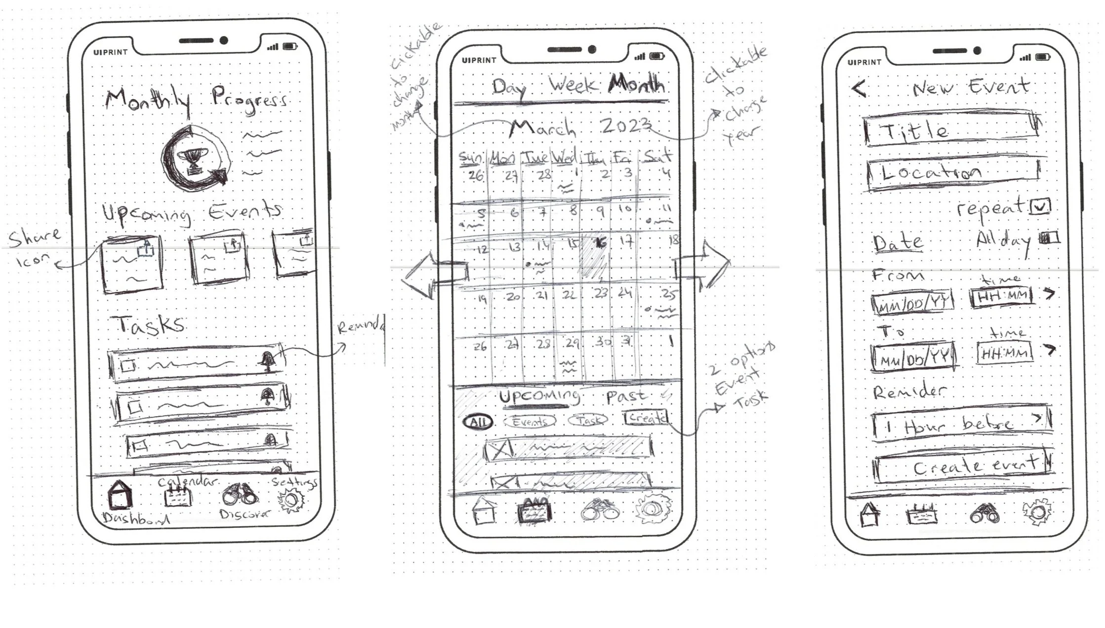
SKETCHES
After gaining an understanding of my target audience's needs, all of my design decisions were based on the persona I created. I came up with sketches of an app that will have the option to assign tasks to a partner and share a calendar with a partner, with the option to keep privacy by the user choosing what to share and what not. Another main feature of the app is the ability to sync the app with other apps which allows the user to book different activities directly from the app.

GUERILLA TEST
For my guerilla usability test, I used Marvel Pop to preview my sketches. I tested five users and I was mostly looking to see if the navigation is in a logical order and if it is clear how to make simple actions on the app. The sketches I used were from the red routes that I created (sign up to the app and add a new event on the calendar, and make a reservation with a restaurant). My goals were to watch the users interact with the app and recognize areas where there was confusion and areas that required a better experience for the user.
FINDINGS:
The layout of the app and navigation bar at the bottom made sense to the users
The Discover icon was a little confusing
It took the users time to understand how to make a new reservation
Shortcuts to different actions can be useful for the user experience
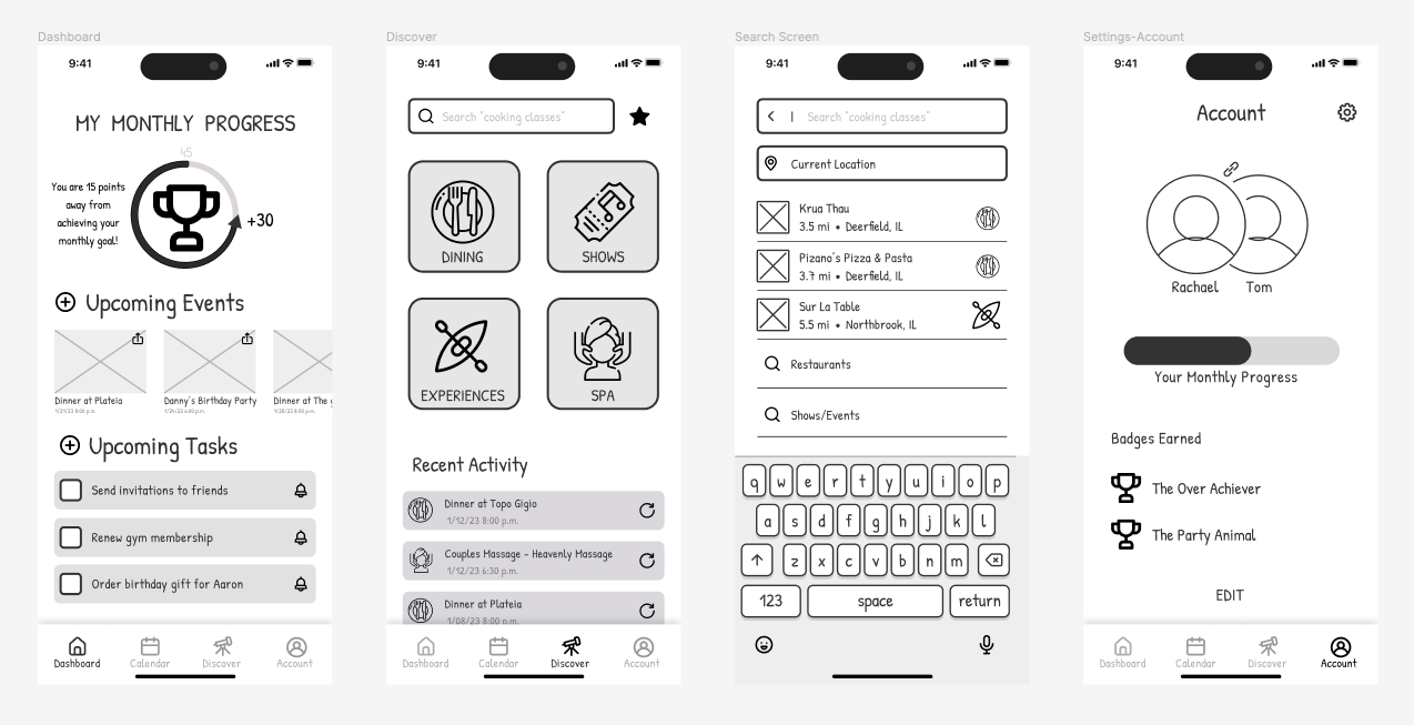
The next step after testing the sketches was to create the wireframes, based on the feedback I received. I knew that the app must be very simple, straightforward, and shareable. In the wireframes, I focused on keeping the layout clean and simple. The red routes I focused on were to add your partner to the app, create a new event, and book a new activity on the app. These are three crucial features for the success of the app with the target audience.
WIREFRAMES
In my mood board, I wanted to create a feeling of something clean, colorful, organized, encouraging, and fun.
MOOD BOARD

VISUAL STYLE
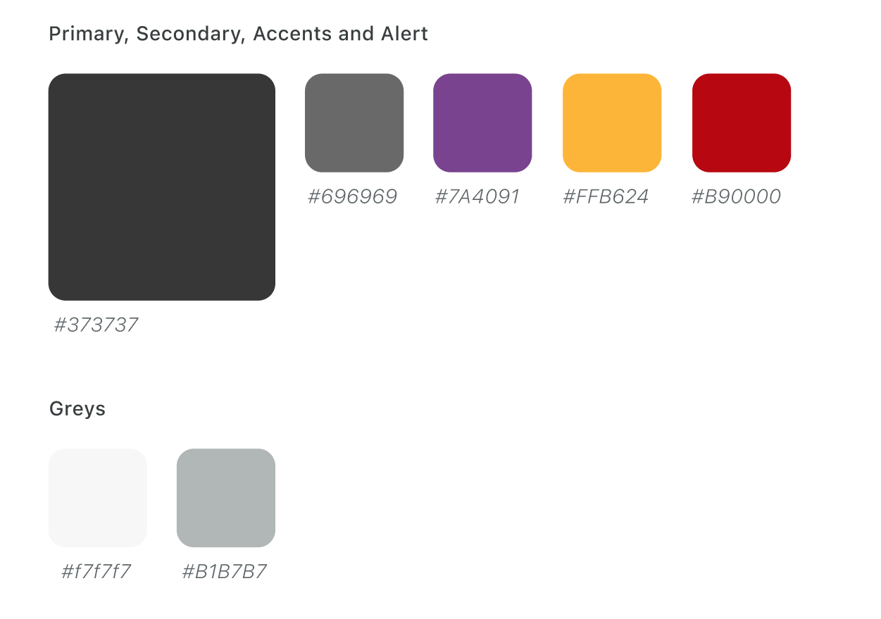
COLOR
After testing a couple of different accent colors for the app, I picked the color Purple (#7A4091), as I wanted a color that would represent a professional, yet warm and welcoming color.
LOGO
I wanted a logo that would represent a friendly app that has a mission to make the user’s life easier and more convenient, like a good pal.
COMPONENTS


TESTING
USABILITY TESTING WITH FIVE USERS
After completing the high-fidelity screens, I conducted a moderated usability test with five users—parents of young children meeting my target audience criteria. They were assigned five tasks on the app, and most tasks were completed easily. However, some points emerged as confusing or frustrating.
The initial navigation bar I designed featured four tabs: Dashboard, Calendar, Discover, and Account. Users found the 'Discover' tab unclear in its meaning and contents. Another challenge was the confusion surrounding how to make a new reservation within the app. Some users attempted to use the calendar tab and hit the '+' icon, only discovering the correct process (through the 'Discover' page) after exploring the app. One user couldn't figure out how to make a reservation, highlighting the need to address this issue.


TESTING TWO VERSIONS
After the first round of the moderated usability tests, I realized that one of the main issues the users faced was figuring out quickly how to make a new reservation. Naturally, some clicked right away on the “+” icon next to “Upcoming Events” (which took them to create a new event) and it took some time to learn to do it through the “Discover” page.
I decided to make two versions of the app and test which version would make the task of making a new reservation easier and quicker.
Version # 1 - Plus Button - This version kept the design of the app as is (with the “Discover” tab), except, an option of “make a new reservation” was added as one of the options that pops once the user clicks on the “+” icon in the dashboard or calendar pages.
PROS
Adding a shortcut to make a new reservation, so it can be done in more than one way
Easy way to make a new reservation from an icon (“+”) that is naturally associated with adding an event or reservation (as seen in the previous usability test) by users.
CONS
It takes some learning to understand what the word “Discover” means and how to use this page in a sufficient way
It adds one more step for users who want to quickly create a new event (instead of going straight to create a new event once clicking on the “+”- the user needs to pick an action)

Version # 2 - Reserve Button - In this version, I kept the functionality of the “+” buttons to only create a new event or a new task. What changed was the bottom navigation bar, in which I changed the “Discover” tab to “Reserve” instead, and changed the icon to a hotel bell icon.
PROS
Keeping the functionality of the commonly used “+” buttons to do simple tasks (either adding a new event or adding a new task)
The word “Reserve” is more clear in the context of what it is there for.
CONS
There is only one way to make a new reservation
This can cause frustration with the users who expect the “+” icon to help create new reservations

THE RESULTS
Six users were chosen to participate in the second round of the usability test; three users for each version. Out of six people, all of the users successfully completed the task of “creating a new reservation”. Four users made their reservations through the “Discover”/”Reserve” tabs. All three users who tested version #2 (“with the “Reserve” tab) went right to Reserve and made their reservation quickly from there. One user from version #1 (“Discover” tab) went to the “Discover” tab and made the reservation from there.
Conclusion - Version # 2 is easier to understand and was more successful. It seems that the word “reserve” gives a better hint regarding what content you can find in it and what actions you can take in it.
CONCLUSIONS
HAVE IT ALL BUT MAKE IT SIMPLE
I started this project trying to find a solution for the neglect of the relationship between new parents. My research helped me understand the reasons behind it and with users' usability tests I came to the realization that the app need to have a few key features in order to answer the needs of Rachael Greene, my persona.
First, the app needs to be sharable and synced with a partner. The ability to plan together and sync the calendar of the partner is crucial for successful mutual planning.
Second, in order for the users to use the app to plan their activities, it cannot be just another calendar app, it needs to give them some added value. The feature of having the app being a one-stop shop by being synced with different planning apps gives the users what they need: make all of their plans in one place!
Third, with the abundance of apps, and lack of time, the app needs to have a simple and user-friendly design. I focused on making the design inviting, easy to understand, and fun.
IF ONLY I HAD MORE TIME
I believe that the app provides a good solution for young parents to improve their planning and be more efficient about it. It gives the users a user-friendly platform to make all of their plans, share them with their partners, and even encourage them to plan more fun things together.
If only I had more time, I would focus on improving the sharing features of the app, such as the events’ edit option by the partner, sharing an event/task with other users that are not your partner, and more.
The app as it is right now can be improved but it does give a good solution for young parents to make their plans in an easy and efficient way.
REFLECTION
THE USER ALWAYS COMES FIRST
When I started this project I already envisioned in my head what the solution should look like. That partly happened since I am a potential user myself as I experienced the problem I was trying to solve. I quickly realized that first I need to get a better understanding of my users and their needs. The solution will come at the right time once I can realize and define the problem. When I finished the research phase, I had a much better understanding of my users, and therefore, I could come into the correct solution to my problem, putting the user in the center of my solution ideas.
TESTING, TESTING, AND TESTING
As I progressed with the project, I started to see the final product coming to life. What mostly shaped the final product to be the best version of itself is all the testing on real potential users. With every feedback I gained from each testing phase, starting from the guerilla test and concluding with testing two different versions of the app, I could improve the app and make it more user-friendly for my users. Testing helps set aside my biased thinking towards the app and gain true feedback that helps the app to be more focused on the user's needs.


